Belarusian HTP changed the logo
Hi-Tech Park has rebranded, updating the logo and corporate identity, devby.io reported. You can check out the new style on the park's website.

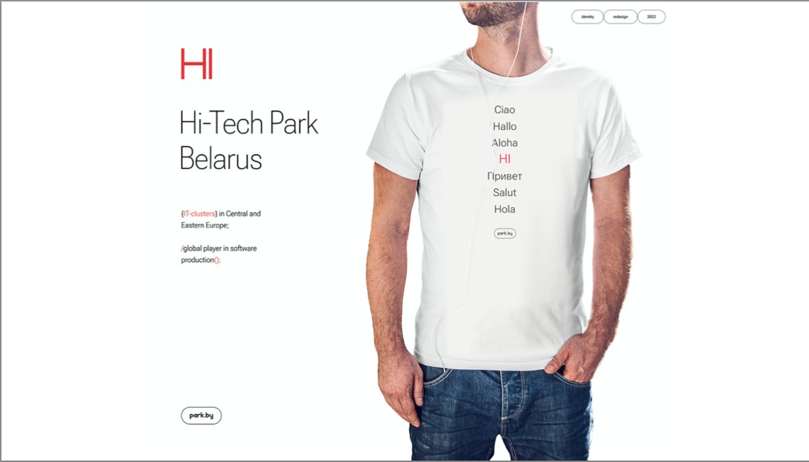
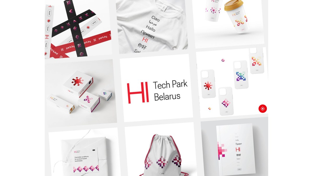
HTP says in a press release: "The task has been completed: now the logo is more modern and expresses openness to all industry participants, current and future. The starting point was a simple and at the same time understandable greeting "HI". This idea formed the basis of the brand's visual and verbal communication system with all residents of the Park, both current and future. Geometrically simple sign allows you to easily fit it into the necessary context, and additional visual elements complement it. Developed graphic elements have become part of the corporate identity, the idea of which is to combine the digital environment and the national ornament."

HTP turns 17 in September. This is the most dynamic sector of the Belarusian economy, which accounts for more than 5% of GDP. Therefore, it was decided to update the design to increase the recognition of HTP both inside Belarus and abroad.

Follow us on Facebook, LinkedIn!
Photo: mtdata.ru


 Back
Back

